There are endless possibilities
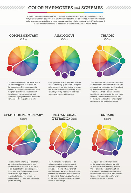
The above image is a great source to pick out what colors you want to use that go well together. And you can rotate the guides around the color wheel. For example, the split complementary wheel is showing red, yellow-green, and blue-green. You can rotate that so the red will be replaced by yellow-orange, the yellow-green is replaced by blue, and the blue-green is replaced by violet. You can do that with each of these color wheel examples. Color wheels are a great source to choose colors from!
But don't be afraid to use black and white as colors as well!! They are the easiest colors to see and are used to balance the rest of the colors.
But don't be afraid to use black and white as colors as well!! They are the easiest colors to see and are used to balance the rest of the colors.
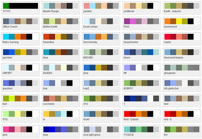
The image above just shows a few of the color palettes possible to use. It is easier to decide what colors to use if your organization has specific colors (UD uses royal blue, gold, and white). If you are making a poster for fun, you have more freedom with color choices.
You can use combinations of warm, cool, dynamic, bright, dark, and pastel colors. Just because you start with orange, it doesn't mean you have to only use warm colors. It is hard
You can use combinations of warm, cool, dynamic, bright, dark, and pastel colors. Just because you start with orange, it doesn't mean you have to only use warm colors. It is hard
